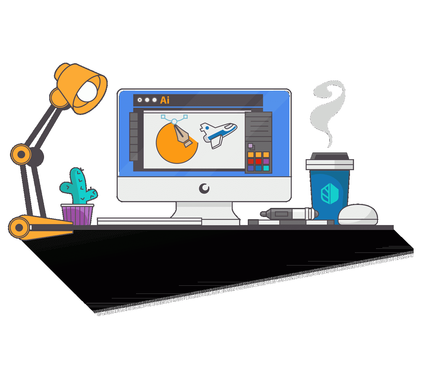
Logo Design Strategy & Tips | Take your Brand to the Next Level
What is a Logo?
A logo is a symbol, graphic mark, emblem, or stylized name that you use to identify a company, organization, product, or brand. It might take the form of an abstract or figurative design. Or it might present as a stylized version of your company's name if it has sufficient brand recognition.
Logos have turned an essential part of an organization's brand identities. An instantly and widely recognized logo is a valuable asset for a corporation, and it has a trademark for intellectual property protection in a lot of situations.

While logos aim to achieve instant brand recognition, some cleverly maintain hidden messaging that only eagle-eyed consumers might spot. Take into consideration the logo of the package delivery company FedEx. A close study of the logo shows that the negative space between the letters' E' and 'X' shows an arrow. It suggests the delivery accuracy and forward-looking business dynamics. Another good example comes in the logo for Wendy's restaurant. The lines written on the collar of Wendy's blouse spell out the word "MOM" to provide a homey feeling.
The use of color is an essential component in logo design. Due to the mechanics of the human visual perception, contrast and color are critical to detecting visual details. A vast majority of consumers tend to associate different colors, different color combinations with different meanings. As an example, in the U.S., white, red, and blue colored designs represent the feelings of patriotism.
A Brief History of the Logo

Logos have been in existence for decades. The earliest logos were nothing more than just simple, distinctive markings, symbols, or authentic brands. They got created to signify the maker of a product or communicate the kind of products that a specific merchant was selling. For instance, under the reign of Henry III, in the year 1266, England's Parliament passed legislation. It required that all bakers use a distinctive mark for the bread they sold. Historians deeply believe that this was England's first legislative act relate to trademarks.
The modern logo started its transformation following the introduction of the trademark laws in the 19th Century. Jack Daniels' iconic logo got created back in 1875, shortly after Congress passed the U.S. Trademark Act of 1870. It was an attempt to establish a federal trademark regime which was then rejected by the Supreme Court. In 1876, the Bass Brewery's famous red triangle became the very first trademark to be registered in the U.K. after the Merchandise Marks Act that passed in 1862.
As the Victorian era progressed, and the first brands got established, these trademarks became more complex. They evolved into logos, as the discipline of graphic design emerged as a form of art. Modern-day logos have shifted from complicated visual statements, back to more simplistic imagery. It is to stand out in a world of visual overload, and make them more easily recognizable across various media channels, including tablets and mobile phones.
What is the Purpose of a Logo?

The key role of a logo is to identify. Keep in mind, as it trumps all other advice you will ever hear. Identification is what matters. That is it.
Trends often come and go, design tools, and the techniques will transform. What we perceive a logo to be might even drastically change with time. Still, for all eternity, the most critical goal of a logo will always remain this – to identify the person, business, product, or service you are designing it for.
It means, as a designer (or a business owner), before you work on any ideas, you need to understand the environment in which the logo is seen ultimately. Who are the brand's key competitors, and how do they look at it? What established competition already owns colors and symbols? How can we differentiate the logo, so that our business stands out from the rest?
Logo Design is a Strategic Tool – It is not Art.

Logo designing is not art. A lot of people mistake themor art since logos are also a visual object.
Our role as designers is not to design a thing of beauty and not to design something the client or we personally like the look of. Still, instead, logo design requires to be treated as a strategic business tool that will let a company get identified in the vast world in which we live. Of course, a logo can still look great, but that should be a secondary factor when designing a logo. Identification comes first.
A Logo Design does not need Hidden Meanings
Designers often try to fill a logo full of meaning from the outset. However, this is not needed – the focus should be on identification. Any purpose or association will come with time through the interaction with the logo.
A new logo is like an empty vessel, and from day one, it merely has no meaning to onlookers. Even if it got added intentionally, with time meaning will be combined through ongoing marketing and the interactions your customers have with the company's brand.
Why do Logos Matter?

They are the Face of your Business, Product or Service
When you think of a business in your mind, you immediately get the picture of a logo. Be it the golden arches of the famous fast-food company, or the apple with the bite out of it, representing one of my favorite technology brands.
Likewise, when you see a logo you are familiar with, you will immediately associate it with your memories, experiences, and interactions with the specifics
Establish Instant Brand Recognition
A well-designed logo will bot only be memorable but will help the customers to remember the brand.
Colors and shapes are more natural for the human brain to process and memorize than words are. It means that if the identity is unique in the marketplace, it is easy to find and identify the company to purchase its services, and to recommend to friends.
Logo Design Influences our Decisions
From the very first day, we created a visual library in our mind and started to associate fonts, shapes, and colors with certain emotions and objects.
By merely looking at a logo, like it or not, we will immediately make judgments, and perceive a business, product, and service in a specific way.
If we think a company seems too expensive, too corporate, too fun, or too radical, we will avoid it. Similarly, if the logo looks like the kind of company, products, or service we are searching for and wish to be linked with it. We will get actively engaged with the company and buy its products or services.
That is why it essential that the logo correctly represents the business as you strongly desire to attract the right target audience.
The logo creates the expectations of the company, and if it fails to meet the expectations, or if your business attracts the wrong people, things will start to go downhill. Your time and money are waste serving people that will not become potential customers. It is potentially even bad reviews from a disappointed customer. Getting the logo right matters.
With a lot of businesses in the world, a company only has one chance to impress and attract. If the logo design fails to impress the onlookers in today's internet-driven world, it is effortless to go somewhere else.
Some business owners use the DIY route or utilize low-cost amateur designers. They do not understand how damaging poor design can be for the clients when first impressions matter a lot.
I love the saying that 'there's nothing more expensive than the cheap design.' It sums up the losses that the company is causing by accepting the cheapest and quickest way.
Communicate Brand Values & Additional Meaning
Although a logo's core purpose is to identity, it can also leverage to communicate essential brand messages and values. Just assure you to keep it simple. Ideally, stick to just the one core idea.
As g, the logo design for Amazon has a smile beneath its name, communicating the happiness of receiving something you have wanted. The positivity gets enhanced by the vibrant orange color, a color that I associate with fun, warmth, and the sunshine. Furthermore, the smile is also an arrow connecting the A to Z. It shows that they offer a wide variety of products – very intelligent.
As another example, the logo for delivery company FedEx, while looking immediately corporate and professional. It has an arrow cleverly hidden within the white space of the E and X to symbolize the speed and precision.
By thoroughly understanding the role of a logo design, you will be able to build stronger brand identities that will perform better for the business.
Why Are Logos Important?
Logos matter a lot, and here is why.

They are Your Brand's Face
Think about any business that you want. Nike, Ford, anything works. The first thing that you will think about is probably its logo, right? If someone asks you to design a comic book based on the brands as comic characters, their logos would be the faces.
When you get in eye contact with a logo that you have a good history with, you will associate those experiences and memories with it.
Brand Recognition
A great logo provides an instant memory of your brand into a customer's mind. Simple colors and shapes are the easiest things for people to process. They are so much easier to memorize than the words.
If your logo is a unique and simple image, it will stand out from the crowd in the market, making it easier for your clients to find and identify you.
Influence Our Decision Making
The moment your customer looks at your logo, whether or not they do find it aesthetically pleasing. They are going to begin making judgments about it. That one image will change how they perceive you in some way.
If your clients think that your logo is too much of anything, be it fun, corporate, expensive, or radical, they will evade it. And if the brand and the logo look like it will complement the image they put out in the world, they will consider buying anything you sell.
Your principal aim is to encourage your target audience to buy from you. So, by extension, you should want your logo to represent you in the right way.
Also, from the beginning, your logo will give your customers expectations of your brand, and if you do not meet them, things will go downhill. It is to get this essential to be a part of the branding right.
First Impression
When it comes to impressing and attracting potential customers, you have one chance to get it right. If your logo cant draw in onlookers, it is so easy for people to click away or find something else they live with more.
Poor logo design can seriously damage your business' first impression. If you opt to go DIY or save money on an inexpensive designer, you certainly need to understand the risk you are taking.
Scrimp and save at other points within the branding process, not here. After all, there is nothing more expensive than a cheap design.
Brand Values and Other Meanings
We have hopefully got it stuck in your head that your logo's only mission is to let people successfully identify your business.
It is small, but you can also utilize them to communicate particular messages about your brand's values.
The key here is simplicity. You do not want to try and pack much meaning as you can into your logo. That certainly will just overwhelm and confuse your target audience. Stick to an idea and go ahead with that.
Think again about the FedEx logo. Have you ever notice the little arrow that they hid in the white space between the E and the X? That is a fantastic way for that company to show that they are precise and speedy.
When you understand the role of a logo completely, you will be able to create a better image. It will perform for your business in every aspect: identification and brand values.
Flexibility
Your logo needs to be simple for several reasons. The most essential one is that when they are simple, they are easily scalable to either very small or enormous sizes.
If you make your logo too complicated, full of intricate details, you are going to lose all of those minute details when you shrink it down.
Think about your logo as of where you are going to put it. You will want it plastered on your site, all of your ads, your stationery, brochures, signs, marketing swag, and more. It'll have to translate to vertical space and a horizontal one.
The best way to ensure whether you are satisfied with your logo and that it reaches success out in the marketplace is to get it made by a professional designer. There are some cheap services for logo design online, but it will not be worth it.
The best value that you will probably find is to source from small, local graphic design shops. It is because you could end up paying thousands of dollars to a reputable agency. But with a small-time graphic designer, you can still get a unique, high-quality logo and a personal service to boot.
Tips for Choosing a Logo Designer
Before you choose a designer to do your work, ensure that they understand the purpose of a logo. When you are confident that they know what you are asking of them, ask to see their portfolio.
Ensure that you like the work that they have done previously. There is nothing wrong with a designer who's done a job that does not visually appeal to you. It just means that you do not probably see eye to eye on the vision that you created for your brand.
Talk to some businesses that worked intimately with the designer and figure out if they got the same experience that you are looking for in a logo designer.
Moreover, make an effort to put a clear and precise image of the type of thing that you want in your logo. Even if your designer is known as the best in the world, if they can not understand the image that you want, you are both going to walk away unhappy.
Using Popular Colors
Logos might have one, two, or even a bunch of colors. Color draws the attention of the target audience instantly by being an eye-catching component. Once the viewer's eyes stick to the logo, the design can signal your brand message. So, color plays a crucial role in catching the otherwise wavering attention of people in this modern world.
02. Popular Typefaces

Pros
A typeface can add particular value to the logo design by giving it a sleek personality. You must have seen the logos of rock music bands. They have big typefaces in larger fonts, which represent the loud and bold music. Take sn example of the Coca-Cola logo. It has a classic and a handwritten typeface, which defines this cold drink brand. It provides the company's soft drink business a historical and vintage personality. So, a typeface allows your audience to know your brand personality.
But few of the typefaces are overused. They are marvelous and grab our attention. Such famous typefaces include Myriad, Gotham, Times, Bodoni, Franklin Gothic, Futura, Georgia, Garamond, and Helvetica. Many designers have often used them in a wide variety of logo designs.
One of the pros of using these popular typefaces to create a logo is that people can easily relate to them. They can draw some sets of conclusions on seeing such a logo design. If the possible reaction of the target audience is what your brand wants to evoke, the typeface is suitable for the logo and your business.
So, create a list of the typefaces that you often see around you. Then, know if it is branding your business the way you desire. If it does, then go ahead and utilize the typeface.
Cons
Brilliant colors carry some disadvantages too. With these colors, a logo might look like a routine design that you have seen a lot of times before. Though colors solely are not responsible for creating a clichéd logo, still a unique use of colors can make them more memorable.
All you need to do to make your use of colors stand out is to think of their shades. Colors are available in several shades. An expert graphic designer should avoid those colors and their hues that a client's competitors are already having in their logos as their brand colors. It is the only way to make your logo look different.
03. Cliched Symbols
Pros
Cliched symbols are the ones that we all associate with them the same message. For example, a man with a stethoscope is a doctor; a horse is a symbol of strength and speed; a roof is a symbol for home, etc.
In every industry, there are a lot of logos carrying the symbols that represent it. If you incorporate them into your logo, you will immediately tell the target audience about your business. It means that if there is a mountain peak in your logo, it means you are probably in the tourism or trekking industry.
Are the symbols effective and useful? To some extent, they can express your company's message. Another pro is that they can quickly tell what your business is all about. For example, a fast-food item in logo designs means you run a fast food business, or wheel means you want to convey the rapid service of your company—this message gets delivered with the symbol of the cliched arrow.
For a business that runs on a tight budget, the use of a cliched symbol is indeed the right decision. With it, a company can allow its customers to know about the field of business. Then, the logo itself speaks about your business, and there is no need for additional spending on marketing. You do not need to hire a freelance graphic designer to create your logo this way.
Cons
But when your business has transformed, and you want to enhance your reach in a market, a famous symbol might be harming your business prospects. It is because a different set of customers might not react well to your logo or simply ignore it. Such a symbol might not be able to evoke any meaningful response from your viewers as it lost its novelty value. That is a massive setback for a company that wants to compete hard in a competitive market.
So, make some efforts to create a symbol of your own that is unique and contemporary. People might find it somewhat different, but they will surely get used to it. Later on, they will remember that symbol as they use your products or services. It is advisable to get graphic design services of an experienced designer who can design your logo with the unique use of images.
04. Stock Images
Pros
Stock images are often-used visuals that anyone can access from a lot of online platforms, mostly for free. A lot of designers are already using these images without any further alterations or with minute changes. People, therefore, can immediately know that this specific image is cliched as they have seen it before somewhere.
Another pro of incorporating one such image in your logo is the sense of belonging that it evokes. Since the pictures spell out the subject and make the things look more prominent. Viewers can instantly find out what your business is all about. It is the critical reason for most new businesses using stock images. But make sure that the free photos convey a message of business logos to some extent, at least.
Another great thing is that the cost of your design is down to the bare minimum. The majority of stock photos are available for free or at a meager price. It helps you in keeping the design cost well within your budget.
Stock photos are also a good option when you intend to use logo software to design it on your own. Simply insert the image, and your logo work is mostly done. It is in contrast to the extra efforts that your designer puts in when creating an image, especially for your logo.
Cons
The most significant con of the use of stock images is that they harm your business in many ways. Because they are cliched components, people do not respond to them emotionally. It directly damages your prospect of competing hard in the market. The chances are that people might take your business as non-serious and unprofessional upon seeing those often-used images in your logos. If you intend to create a distinctive brand identity, you should evade using such images.
Therefore, ensure that you create unique images for your logo if you need to use them. If you are looking for a few inspiring examples of image-based logos, then visit the logos of global companies such as Apple, Disney, Nike, McDonald's, Bacardi, and Twitter.
So, these are some of the advantages and disadvantages of using cliched or popular component logo designs. Your efforts should be pointed at creating unique logos that have the components specially designed to suit your specific business and design requirements.
Looking For a Logo Design?

We have successfully helped thousands of business owners from all over the world with their graphic design requirements, such as website design, logo design, social media posts, banner, and much more.
However, a lot of designers abuse the use of colors. They pick any random color without giving a thought to the usefulness in the design. Even a single color can make a logo appear unprofessional if it does not convey the desired message. Other designers unnecessarily incorporate multiple colors to make is appealing.
Remember that expert graphic designers understand the value of colors in evoking your emotions. A modern logo designer knows well how colors can play with our psychology. So, every color today is known for its ability to recall some feelings to the conscious mind.
For example, when we see red color in a logo or somewhere else, we are somewhat charged up with emotions of aggression, excitement, passions, etc., and then possibly react with a few feelings. Yellow is usually associated with the emotion of happiness, and it generates a variety of opinions. So, every color in your logo should be precisely evoking the desired feelings and emotions. These very emotions are also related to your message for your potential customers.
But the use of popular colors such as yellow and blue finds a place in a lot of logos. A significant advantage of such colors is their ready acceptability amongst people. Depending on the local taste and likes or dislikes, the choice of popular colors also varies from region to region.
So, when you use the colors that people like the most, you evoke the right feelings and emotions. This way, you can rapidly establish a connection with your audience. You can then hope to convert as many such viewers as possible into your potential customers.
If you want to learn about Ecommerce read What is Ecommerce? Step by Step Guide